I understand the concept of the graphics being a supplement to the text in NVL mode - sort of just hinting at a scene and be complemented by a more detailed account of the situation in the text - and I think it works quite well when the graphics are simple or simplified, because the text can fill in the detail.
However, when graphics reach a certain level of detail and color variety (which they definitely have done in EH), and you want sprites and not words to convey a lot of the emotions, the NVL mode layout starts to waste that detail with the letters that break the lines (especially bad for registering facial expressions), and diminish the impact of nice colors and lighting by washing them out when looked at through its semi transparent overlay.
So unless there is an artistic message you need to convey, I think that as a general rule when you have nice or detailed pictures, you should use a display layout which highlights them - a good way of determining whether this is the case is whether you present screenshots without the NVL mode overlay, or with it. If your webpage has pictures where the NVL layout is hidden, then you probably like the pictures and want to show them - consequently you should try to show that picture to the player when he is playing, so he can see the information and feel the atmosphere it's giving him.
Errant Heart Discussion Forum
A forum dedicated to the discussion of the Visual Novel, Errant Heart.
http://www.errantheart.net/PHPBB3/
Errant Heart
Page 3 of 5
Re: Errant Heart
Re: Errant Heart
Re: Errant Heart
Re: Errant Heart
Re: Errant Heart
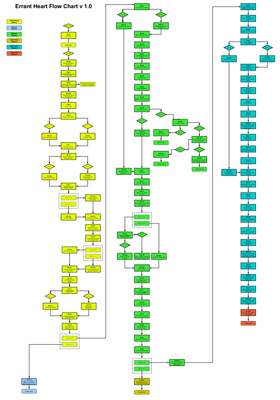
In the event that anyone is interested, here's what the game looks like when flow charted. Just bear in mind that some of the scene names might be the slightest bit spoiler-ish.
Re: Errant Heart
Re: Errant Heart
Re: Errant Heart
I finally got around to giving the demo a spin  Oh free time, how I love thee~
As such, I'm late to the party. My bad.
Overall, I agree with the opinions of the others, but I'll go through my impressions anyway.
Prologue: Ooooo, I liked this. If that shake thing was an error, figure out a way to keep it. I really liked it, it was like a camera shake and went really well with the historical quote, image and music and gave it a sense of realism. It set the scene really nicely.
Main Menu: You know I like the main menu, but I do agree with Ren that it could be refined if you wanted to. I agree with what he mentioned about the layout, though it is functional as it is and I really like the style of the menu. The colour scheme could possible be a bit more towards sepia and I think the black in your logo would be better as possible a grey so it isn't quite so harsh. But overall I like it
Opening Scene: I loved the opening scene. The slow pan was really nice and I thought it worked really we with the NVL window (which has a nice art deco feel to it as well). The backgrounds are gorgeous of course and I like the nice ambient sound (though you could probably get away with a little more if you wanted)
Dialogue scenes: I'm going to throw my hat in with the others and say I'm not a fan of full window NVL for dialogue, especially when the characters are there. I didn't like it popping back and forth when the emotions changed and it was a little difficult keeping track of where I was. I did like the use of the different sprites, the sizing and the panning though, that was really nice.
My first thought was as the others mentioned and have half and half. This could possibly work if you used the panning to move from one character to the next. But that does just make it a vertical ADV window and you have both mentioned you wanted to avoid that.
Since you have a unique graphical problem as well as the view of putting the text above the visuals, I would recommend designing specifically for that. I would chuck what you know about traditional VN interfaces out the window for the moment and consider it as an original problem and use the tools you have to solve it.
Take Hotel Dusk for instance. Because it's designed for the DS it makes use of the two screens in quite a nice way. There is no reason you couldn't do something similar by splitting the screen in two.
And then there is Chensterrain's Dusk which has one of the most interesting GUI I've seen in an indie VN ever. Something like this may very well suit your purposes because the visuals compliment the text and are secondary to it and yet the whole interface is very cohesive.
Re: Errant Heart
Figured I should probably update with something. You know...just to let people know we're still alive and working...
Anyway, here's an example of all the line art for one character—which is comprised of three poses, four outfits per pose, three different hair styles per pose, one alternate head position, a crap-ton of expressions and a partridge in a pear tree...
I suspect this should probably serve as a warning to others—sprite complexity ramps up frighteningly quickly with just an extra pose or two.